30 Nov Fabric Folds
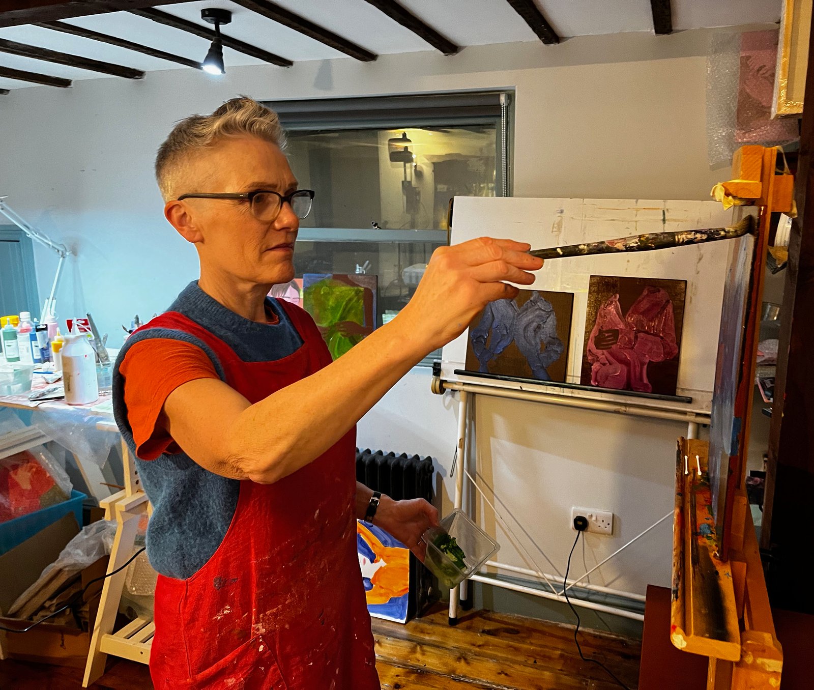
I have had a fascination with fabric for many years. It inspired a short film series called Warp that I made in 2008, and another film ‘Wallpaper’ made in 2011. Fabric has now resurfaced in a series of paintings I’ve been working on over the last year, of a figure wearing a shirt. My interest is in the folds and movement of the material and how they combine with the presence and attitude of the figure. Using big, overloaded brushes I try to find a way to express the fabric in paint, with lively brush strokes that animate the shirt, dancing and weaving to suggest the shape of the body within. The most exciting results of these experiments are those paintings where the colours also work well together. Whether it’s the natural landscape or a painting in a gallery I am constantly looking for colour combinations that have this elusive, almost magical quality and can’t wait to return to the studio to try recreate the alchemy.
A visit to the home of some friends in the Scottish Borders south of Edinburgh last week was full of inspiration. The landscape, which seems on first sight impressively barren, turned out to be full of soft beauty. The low winter sun was frequently shinning and the long shadows, which are fleeting in summer, seemed to stay the same size all afternoon. We stopped to look at Sir Walter Scott’s favourite view which was magnificent.
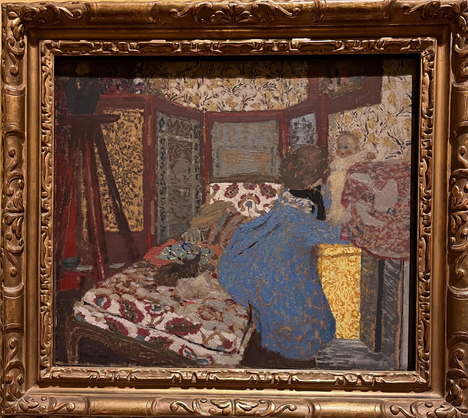
On our way home we paid a visit to the National Gallery of Scotland in Edinburgh. We were fortunate to catch the last few days of an exhibition of French Impressionists to which our friends had lent a painting. There was a work by Edouard Vuillard, a member of the mysterious group who called themselves Les Nabis, ‘the Prophets’. The Nabis pictures were usually made up of areas of flat colour but what has always impressed me about Vuillard was the way his pictures were heavily patterned like camouflage, you have to search for the figures as they seem to be a part of the interior.
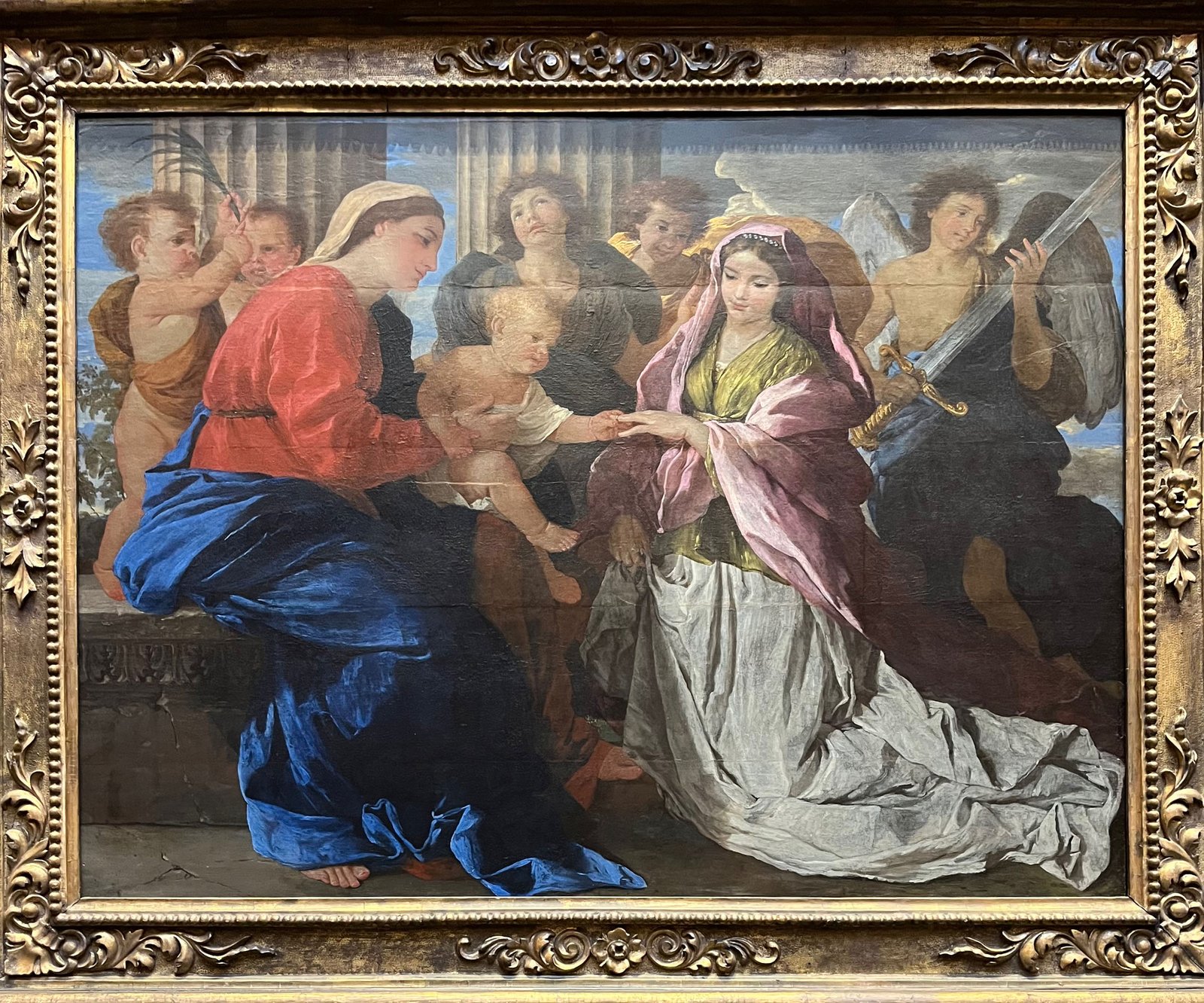
As we found our way to the main gallery time was short and I would love to return and take a more leisurely look, but three paintings I saw made a strong impression. I surprised myself with the realisation that the most recent of them was painted in 1628, Nicolas Poussin’s ‘Mystic Marriage of Saint Catherine’. The explosion of colour on the left of the composition, Mary’s vivid red and blue drapery, is arresting, but the subtlety of Catherine’s earthy green undergarment and her pale pink cloak had me mesmerised.
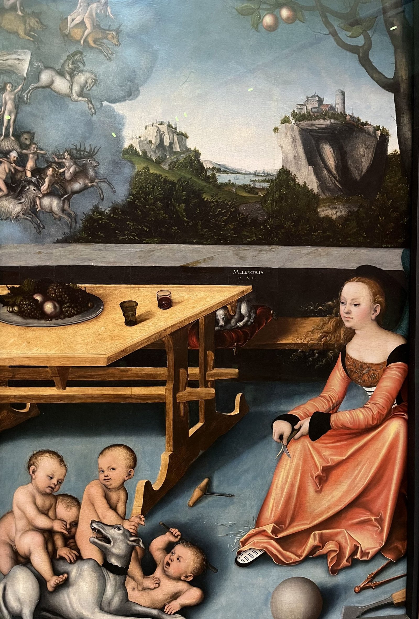
A hundred years earlier Lucas Cranach painted ‘An Allegory of Melancholy’. It’s obvious from the complexity of the painting that melancholy meant something different in Cranach’s time as nobody looks particularly sad or depressed. Once again it was the colour that made me stop and stare, the orange dress of the main figure is the most exciting thing about the picture and the powder blue floor is the perfect foil. The cherubs pink cheeks set off a sublime trio of complimentary colours working together to draw you in to the picture.
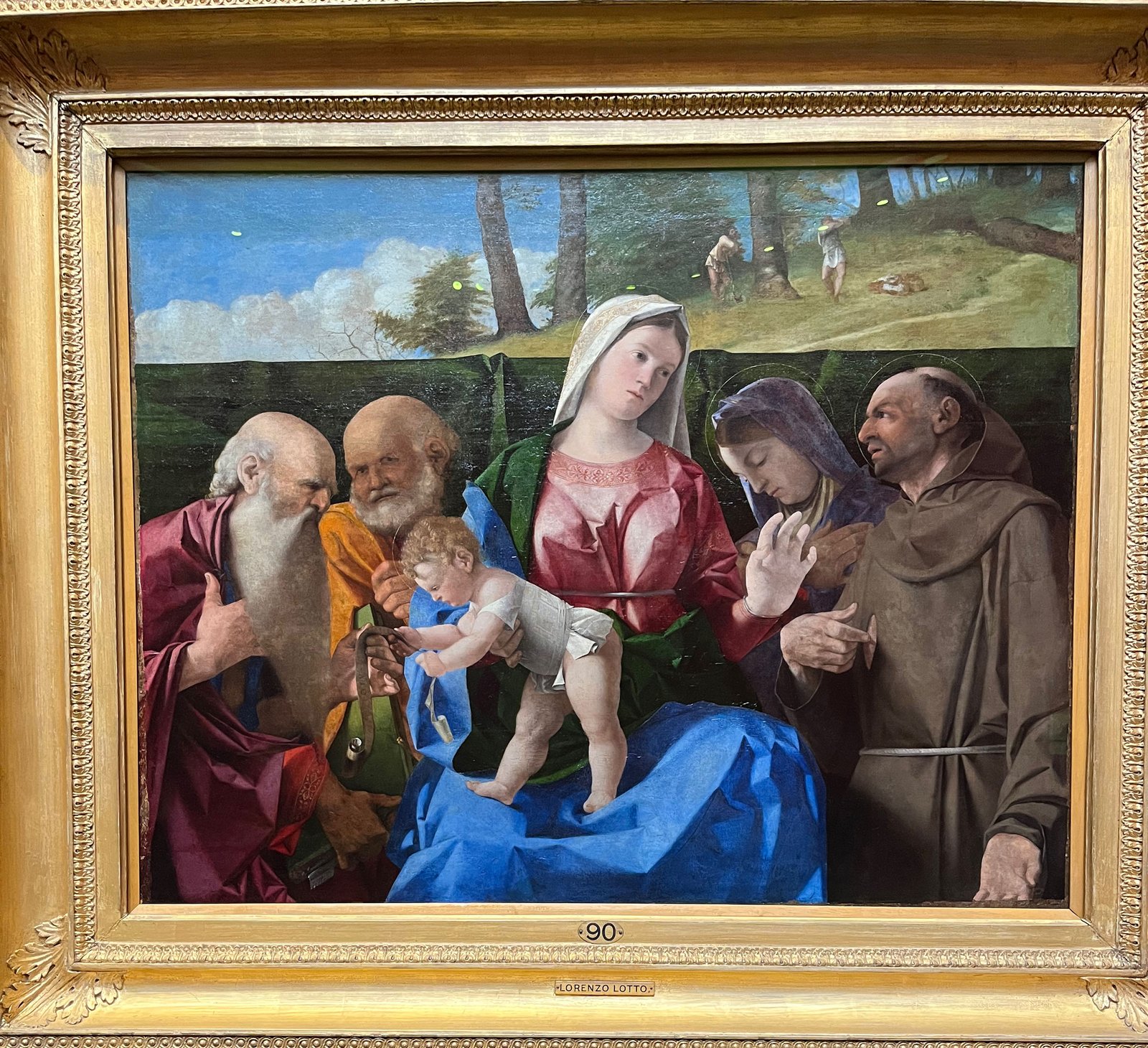
The final work was by Lorenzo Lotto, a Venetian, and showed the influence of Giovanni Bellini who would have been at the height of his fame in 1505 when this picture is thought to have been made. The Madonna is again wearing garments in the traditional colours of red and blue but in contrast to the strident tones used by Poussin Lotto has softened her cloak so it is almost a pastel red and I loved the way this gave life to the folds of the fabric.
I sometimes feel that understanding colour is the most challenging part of making a successful painting, and improving ones knowledge of colour by looking at the works of old masters is a great way to learn lessons.
To hear about new works that have been informed by my latest colour palette experiments sign up to my newsletter.


